
RoughNeck
Energy drink for gym users
RoughNeck is a concept branding project for a high-energy drink designed for gym-focused lifestyles.
The project explores how bold visual identity, strong contrast, and minimal form can communicate power,
focus, and physical drive.
Overview
Background
RoughNeck was created as a conceptual energy drink brand aimed at fitness-oriented consumers. The project focuses on building a strong, recognizable identity that reflects intensity, resilience, and performance-driven motivation.
Focus
The main focus was to design a bold and modern brand system centered on logo design and packaging. The identity needed to feel powerful and athletic while staying clean, minimal, and visually striking on the shelf.
Design Approach
Core Idea
The core idea behind RoughNeck is raw energy and determination. The name reflects strength and persistence, while the brand identity emphasizes momentum, impact, and fast recovery - qualities associated with intense training and physical performance.
Visual Choices
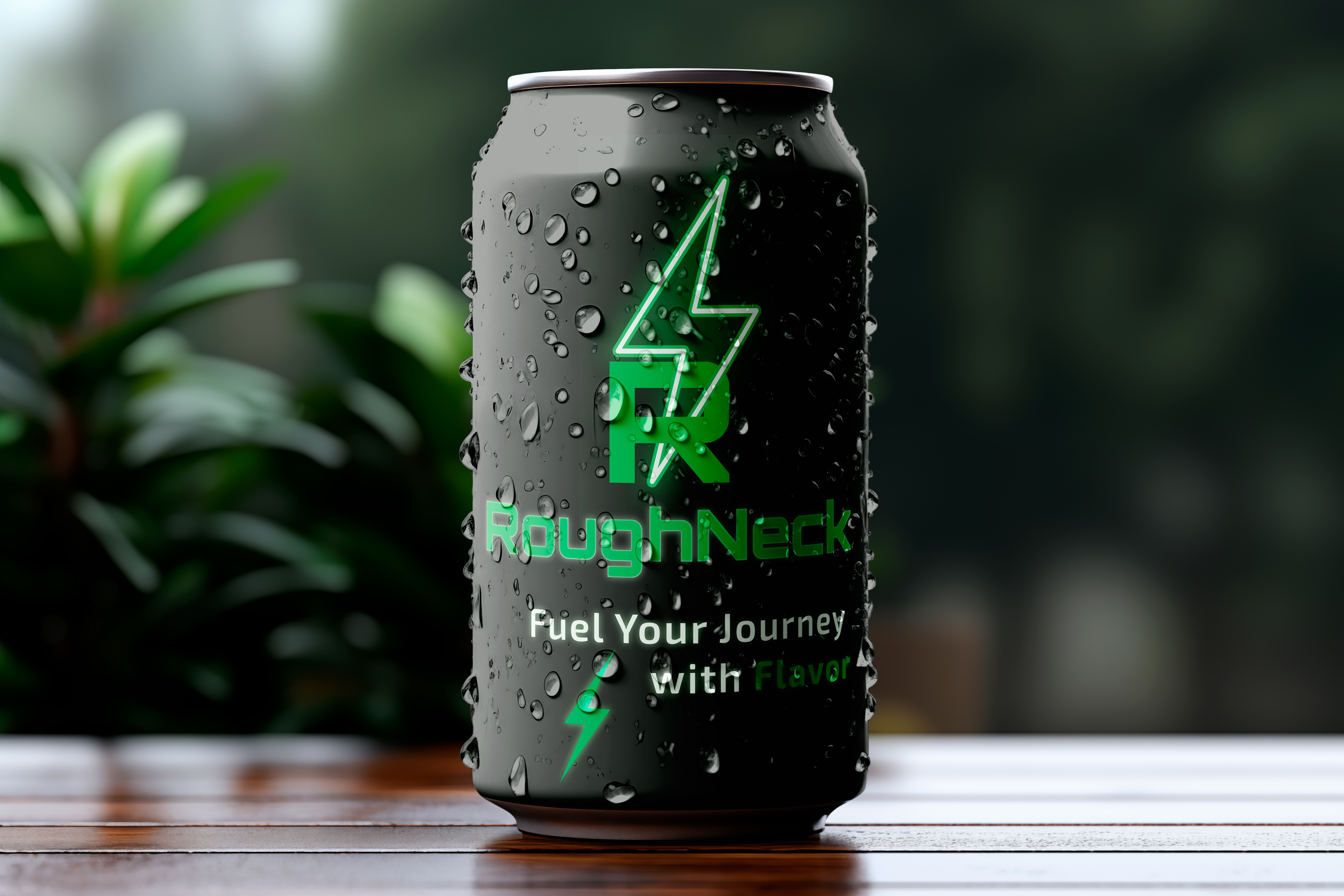
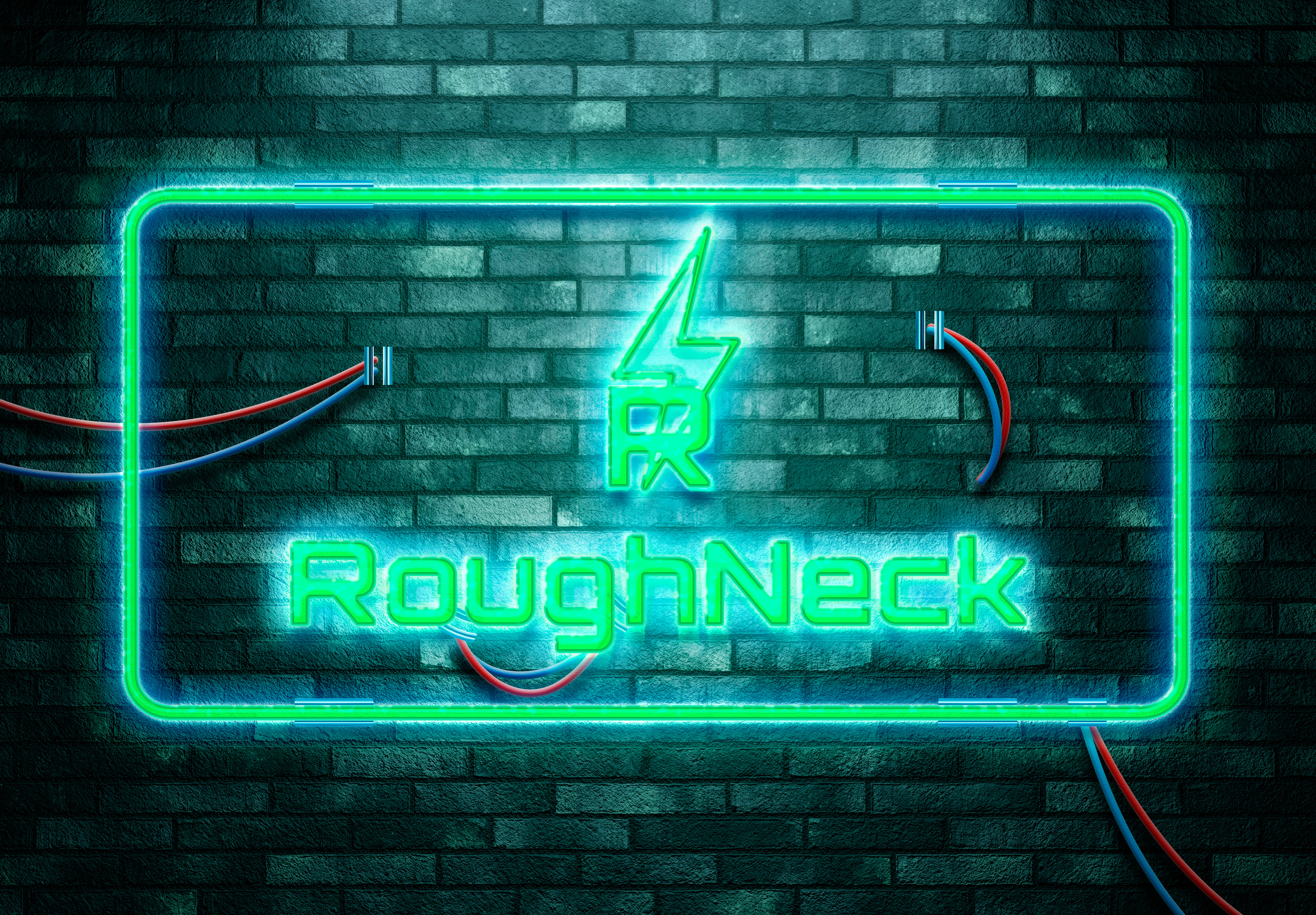
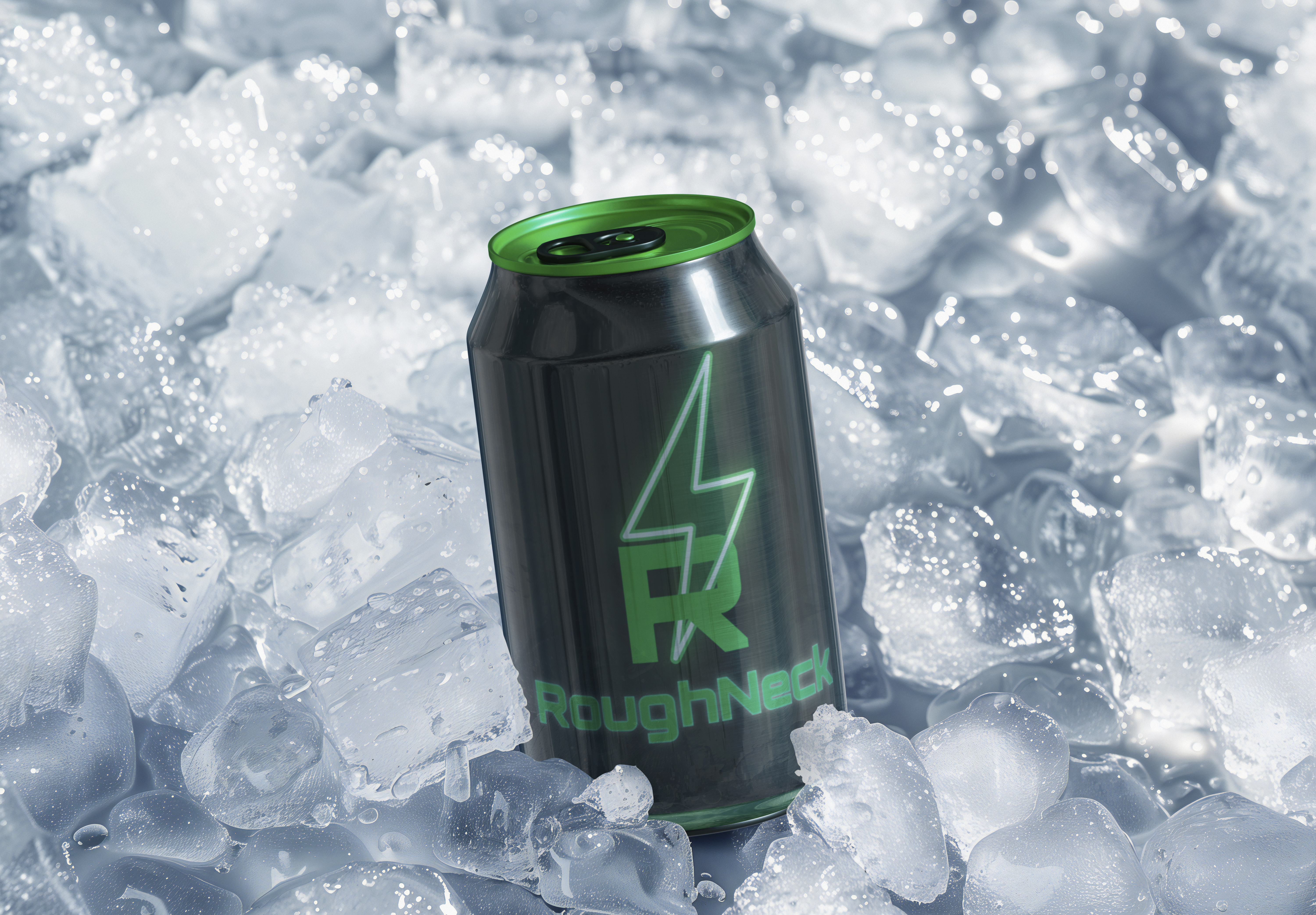
The logo combines a sharp lightning bolt with the letter “R,” symbolizing explosive energy and speed. Strong geometry and angular forms reinforce a sense of control, power, and precision, creating an assertive and confident visual language.
Color & Type
A matte black base was paired with electric neon green to create high contrast and immediate visibility. The typography is bold and condensed, designed to feel aggressive and focused, supporting the brand’s athletic and futuristic character.
Outcome
Process
The project started with brand naming and moodboard exploration focused on energy, voltage, and movement. After refining the logo and visual system, the identity was applied to a sleek can design and presented through 3D mockups using a grid-based composition.
Final look
The final design system is bold, cohesive, and highly recognizable. Strong contrast, sharp angles, and minimal detailing create a powerful shelf presence while maintaining clarity and visual discipline.
What It shows
The project explores how strong visual identity and packaging design can express intensity and focus. The result is a confident system built around contrast, form, and clear brand presence.
Final notes
RoughNeck expresses physical intensity through sharp form, contrast, and restrained detail. The final identity feels controlled, energetic, and suited for performance-focused environments.
Year of
Design Experience
Projects
Completed
Hours of
Design Practice
Design
Certificates