
Gtec
Technology brand concept
Gtec is a conceptual brand identity project for an IT consulting and solutions provider.
The project explores how visual identity can communicate innovation, reliability, and
strategic thinking in a technology-driven business environment.
Overview
Background
Gtec was created as a conceptual brand for an IT consulting company focused on innovation, system integration, and operational efficiency. The brand is positioned as a strategic partner for businesses navigating complex technological environments.
Focus
The focus of the project was to develop a professional and forward-looking identity that feels confident, intelligent, and structured. The visual language needed to convey trust and clarity while remaining flexible across corporate and digital applications.
Design Approach
Core Idea
The core idea behind Gtec was to express progress and integration through a clear, structured logo system. The mark needed to feel technical and precise, while still remaining approachable and readable for enterprise-level clients.
Visual Choices
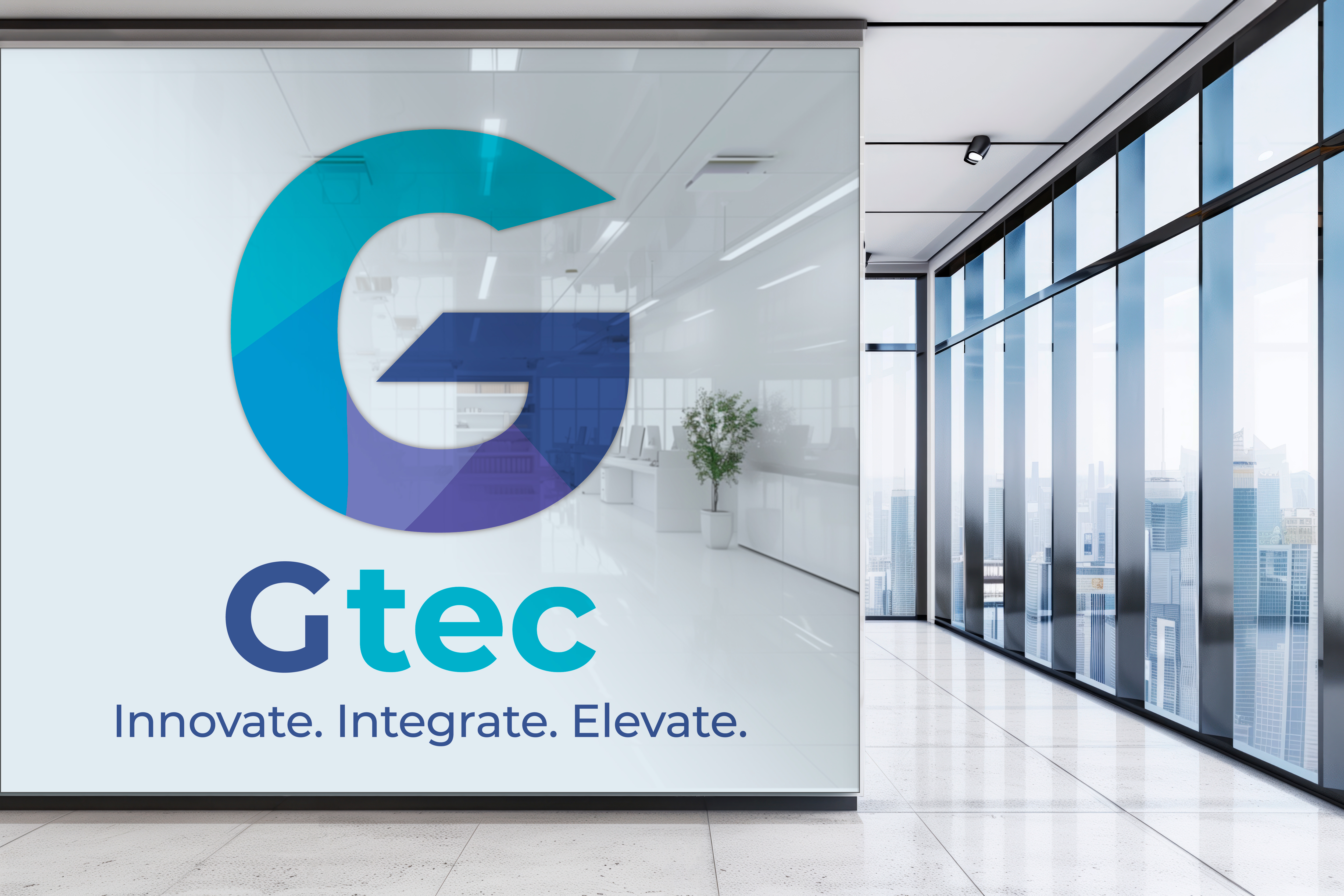
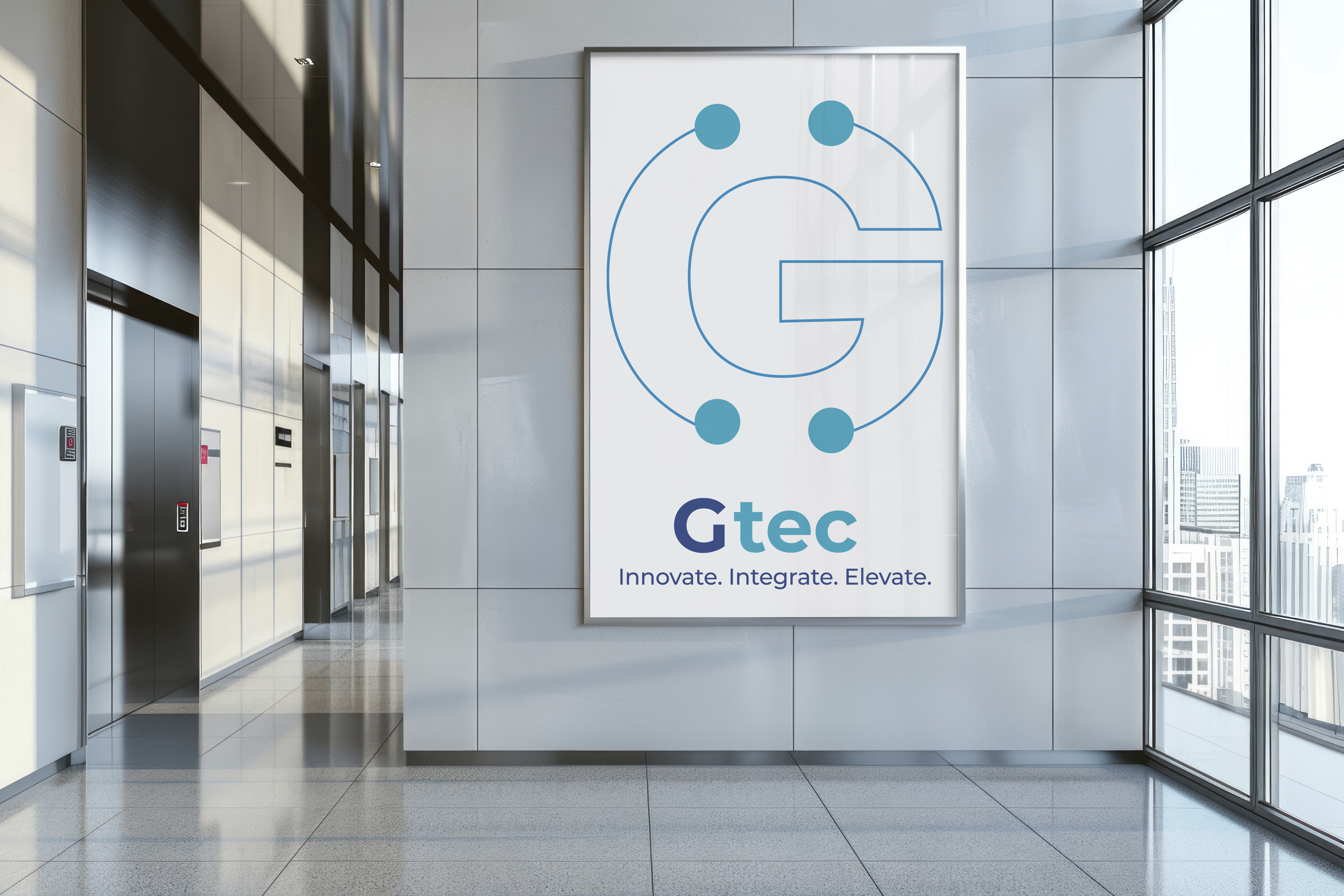
The logo is built around clean geometric forms and directional elements that suggest connection, movement, and growth. Two logo directions were developed - one more minimal and structured, the other slightly more expressive - both designed to work across digital platforms and corporate environments.
Color & Type
Cool blue and teal tones were used to reinforce associations with technology, reliability, and innovation. The typography is modern and restrained, chosen to complement the logo’s geometry and ensure clarity in both large-scale and interface use.
Outcome
Process
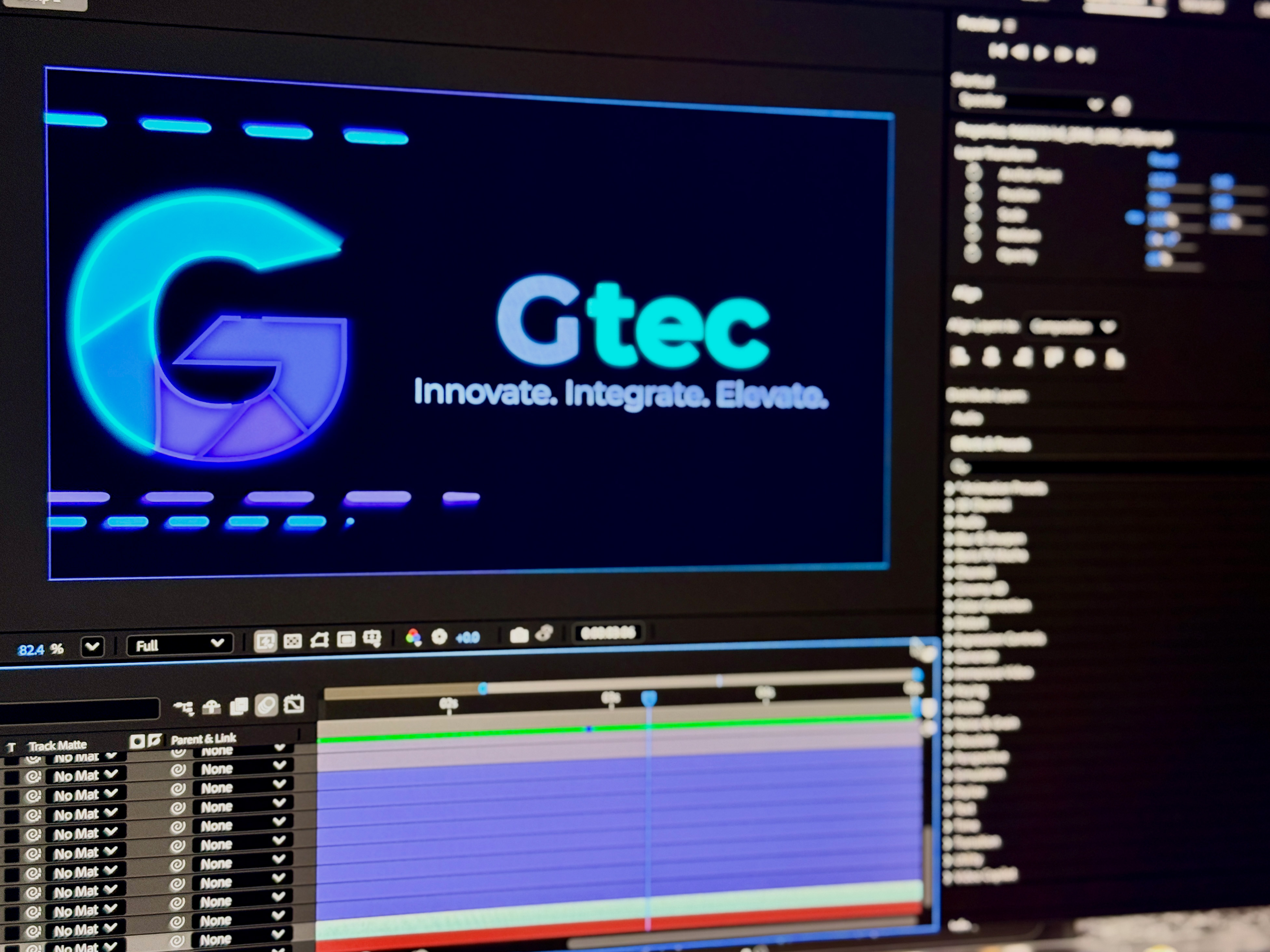
The process included market research within the IT consulting space, exploration of brand values, and iterative logo development. Concepts were tested across digital and corporate mockups to ensure clarity and adaptability in real-world use.
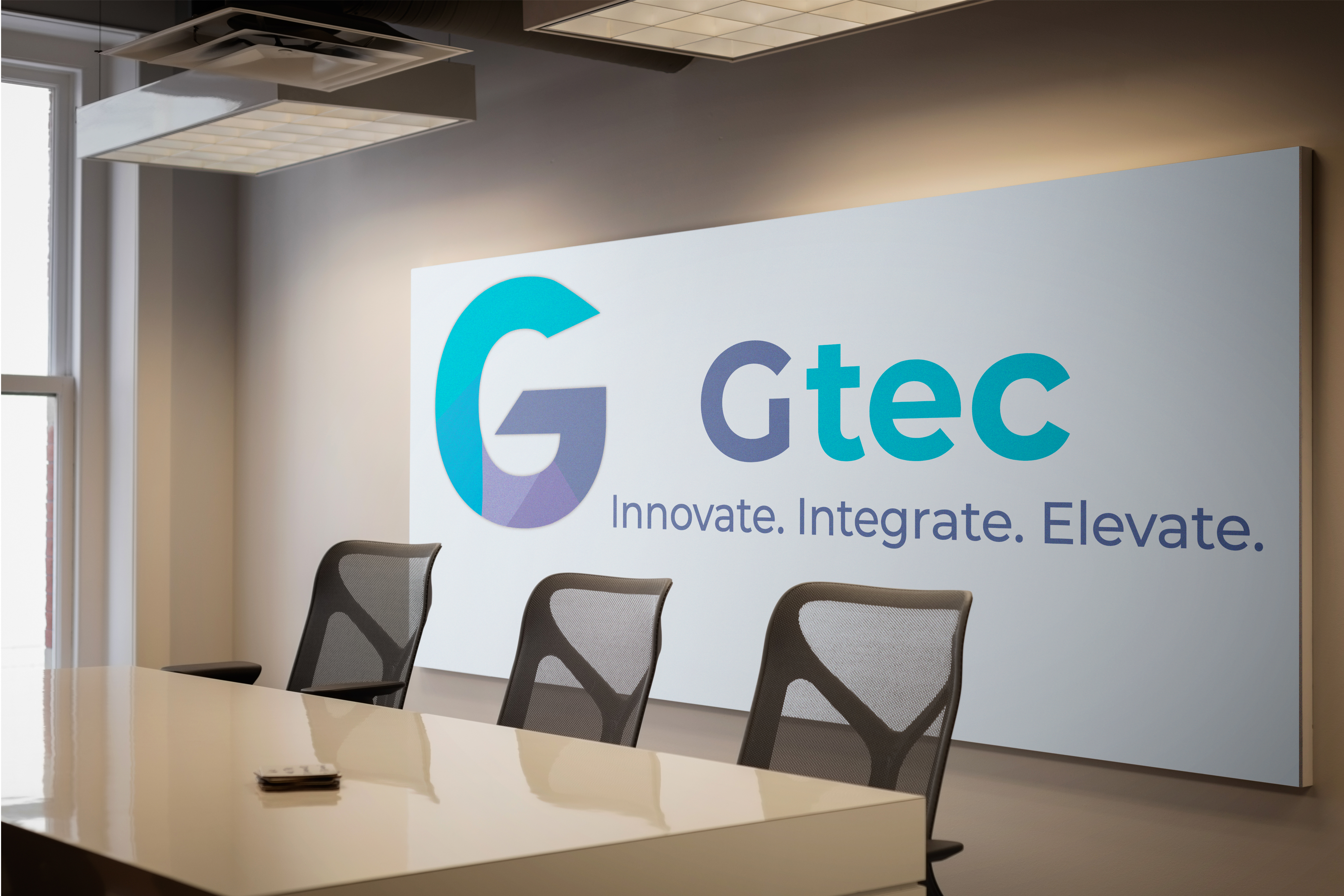
Final look
The final logo system is clean, precise, and scalable. Built around geometric structure and controlled proportions, the mark communicates innovation and reliability while remaining clear and recognizable across different applications.
What It shows
This project demonstrates my ability to design structured logo systems for technology-focused brands, translating abstract concepts like integration and progress into clear, functional visual identities.
Final notes
Designing the Gtec logo was an exercise in precision and restraint. By focusing on form, proportion, and clarity, I created a mark that feels confident and professional, supporting the brand’s role as a long-term technology partner.

Year of
Design Experience
Projects
Completed
Hours of
Design Practice
Design
Certificates