
Photography Portfolio
Visual design
A website visual design focused on structure, spacing, and typographic hierarchy.
The project explores how layout systems and visual rhythm support clear content
presentation and intuitive navigation.
Overview
Background
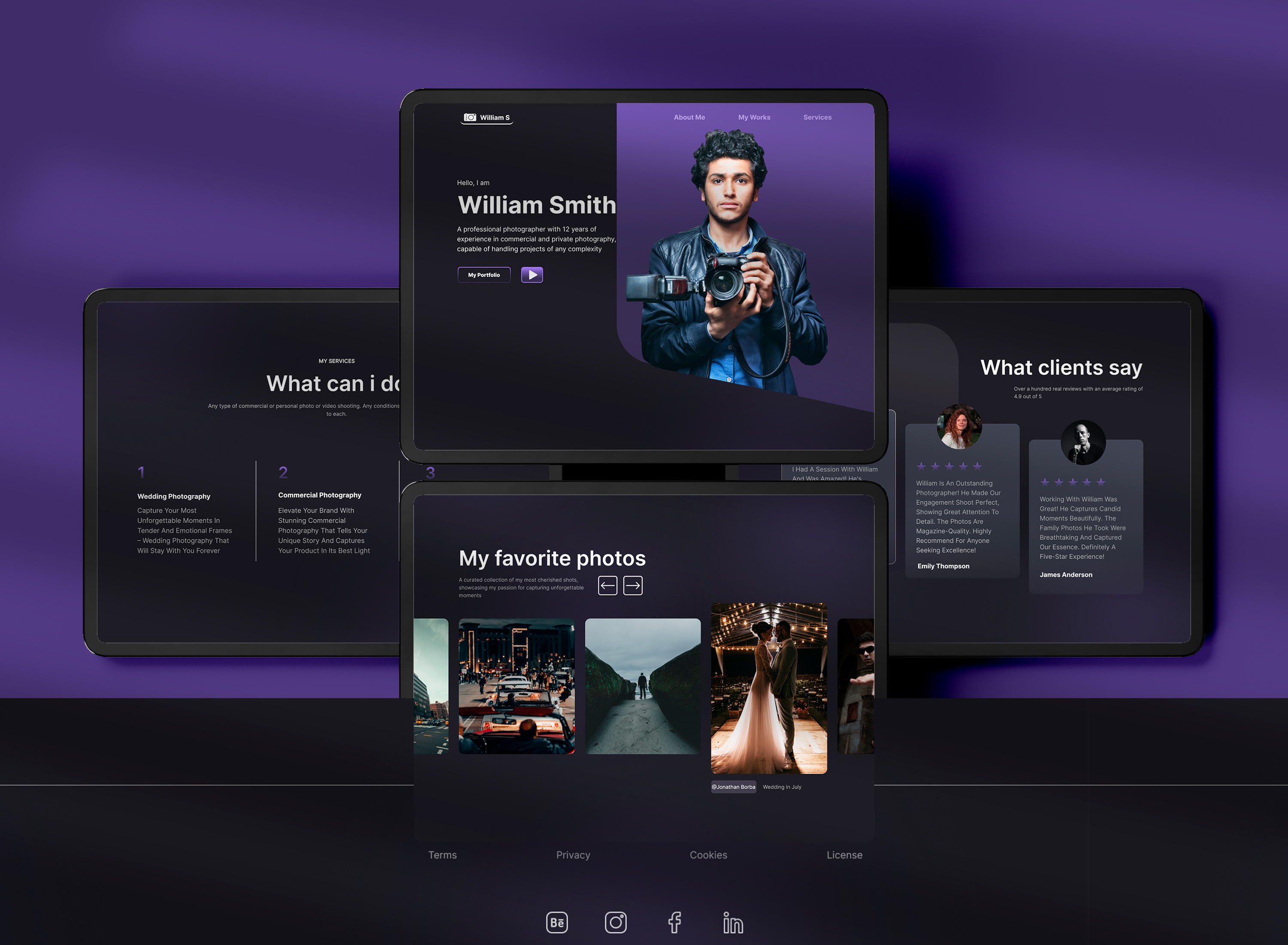
This project was created as a conceptual website visual design to explore structure, rhythm, and clarity in a digital environment. The focus was on how layout, spacing, and typography shape user perception and support intuitive navigation.
Focus
The main focus was building a clean, readable layout with strong hierarchy. The design prioritizes spacing, typography, and consistency to ensure content feels easy to follow and visually balanced across sections.
Design Approach
Core Idea
The core idea was to design a website that feels calm and intentional. Instead of visual noise, the layout relies on structure and negative space, allowing content to breathe and guiding the viewer naturally through the page.
Visual Choices
A modular grid system was used to organize content clearly and consistently. Sections are visually separated through spacing and scale rather than decorative elements, creating a sense of order and flow.
Color & Type
The visual system relies on strong typography and a restrained dark palette with subtle purple accents. Scale, spacing, and contrast are carefully balanced to guide attention while keeping the interface calm, clear, and focused.
Outcome
Process
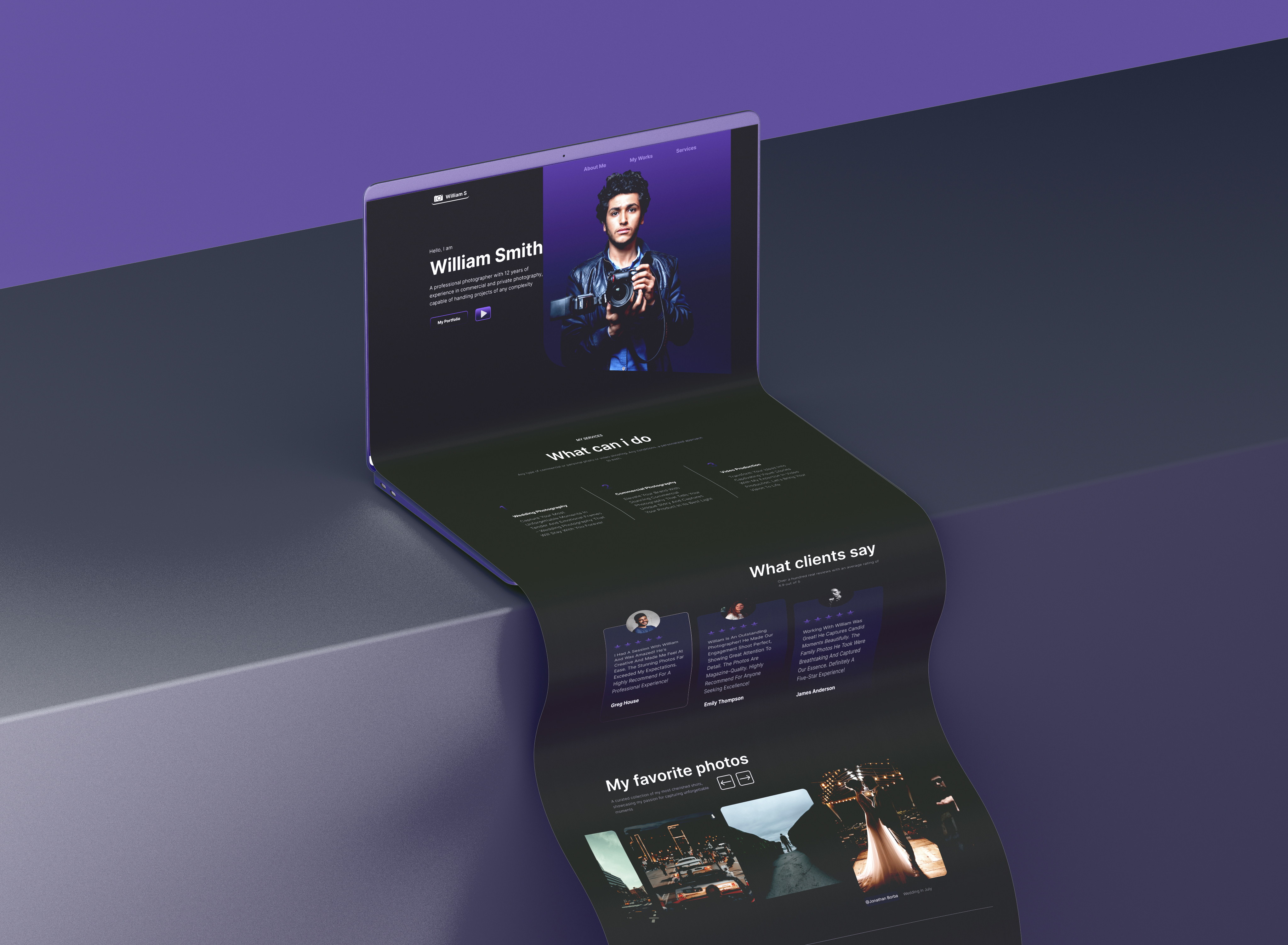
The project was developed as an educational website concept and designed entirely in Figma. The process began with layout exploration and wireframe-style compositions, focusing on content flow, spacing, and typographic hierarchy. A dark interface with restrained purple accents was used to maintain clarity and visual balance.
Final look
The final design feels structured, modern, and calm. A dark color palette with subtle purple highlights creates contrast without distraction, while typography guides attention and organizes content. The layout works as a flexible foundation for both editorial and portfolio use.
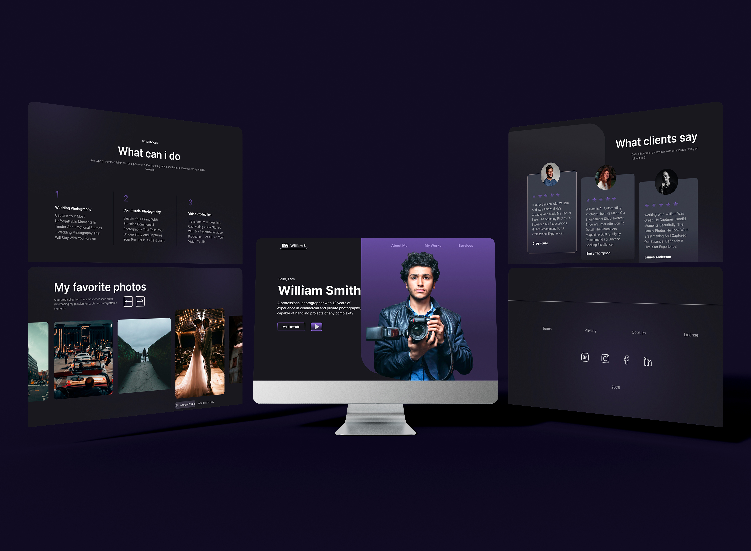
What It shows
This project demonstrates my approach to digital visual design, combining typography, color, and layout systems to create clear, readable interfaces. It reflects my ability to think structurally, design in Figma, and build cohesive visual systems that support content and navigation.
Final notes
This project reflects my preference for clarity over decoration in digital design. By focusing on structure, typography, and restraint, the layout prioritizes content and usability, resulting in a calm and confident visual experience.


Year of
Design Experience
Projects
Completed
Hours of
Design Practice
Design
Certificates