
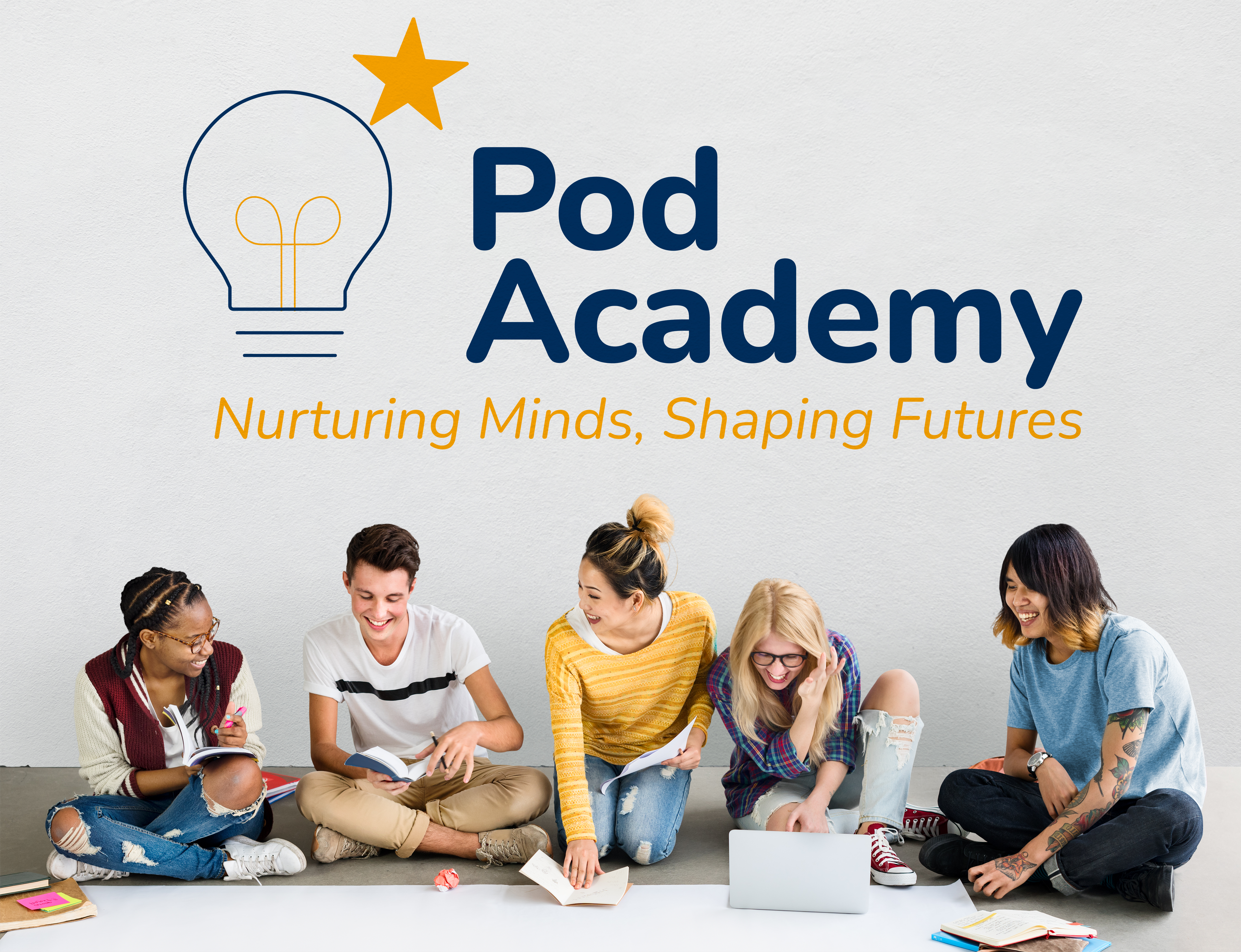
Pod Academy
Learning-focused visual design
Pod Academy is a conceptual brand identity project for an educational tutoring and
enrichment center. The project explores how visual design can support learning,
curiosity, and personal growth in a modern educational environment.
Overview
Background
Pod Academy was created as a concept for a contemporary education center focused on teenagers and young adults. The brand is designed to feel supportive and inspiring, combining academic credibility with an approachable and modern visual language.
Focus
The focus of the project was to create a clear and engaging identity that appeals to both students and parents. The visual system needed to communicate trust, motivation, and structure while remaining friendly and accessible.
Design Approach
Core Idea
The core idea behind Pod Academy is creating a clear and supportive learning space. The identity focuses on structure, encouragement, and accessibility - helping students feel confident, motivated, and focused on progress.
Visual Choices
The logo combines a lightbulb and star symbol to represent knowledge, ideas, and aspiration. Simple geometric forms and balanced proportions were used to ensure the mark feels clear, optimistic, and easily recognizable across different applications.
Color & Type
A balanced color palette pairs deep blue tones with warm yellow accents to communicate trust, focus, and optimism. Clean, modern typography supports readability and reinforces the brand’s educational and forward-looking character.


Outcome
Process
The process included research into modern educational brands, concept sketching, and digital refinement of the logo and visual system. The identity was tested across signage, learning materials, and promotional mockups to ensure clarity and consistency.
Final look
The final identity feels friendly, confident, and structured. It works across both digital and physical touchpoints, creating a cohesive and recognizable presence for the education center.
What It shows
This project reflects an approach to educational branding that balances clarity and warmth. The visual system supports learning environments while remaining structured, engaging, and easy to navigate.
Final notes
Pod Academy’s identity focuses on clarity and trust. A balanced and welcoming visual system supports learning while remaining professional and approachable.

Year of
Design Experience
Projects
Completed
Hours of
Design Practice
Design
Certificates