
Flora Landscapes
Landscape design and maintenance services
Flora Landscapes is a self-initiated branding project for a landscape design and maintenance company.
The project explores how visual identity can reflect care for nature, long-term growth, and the
transformation of outdoor spaces.
Overview
Background
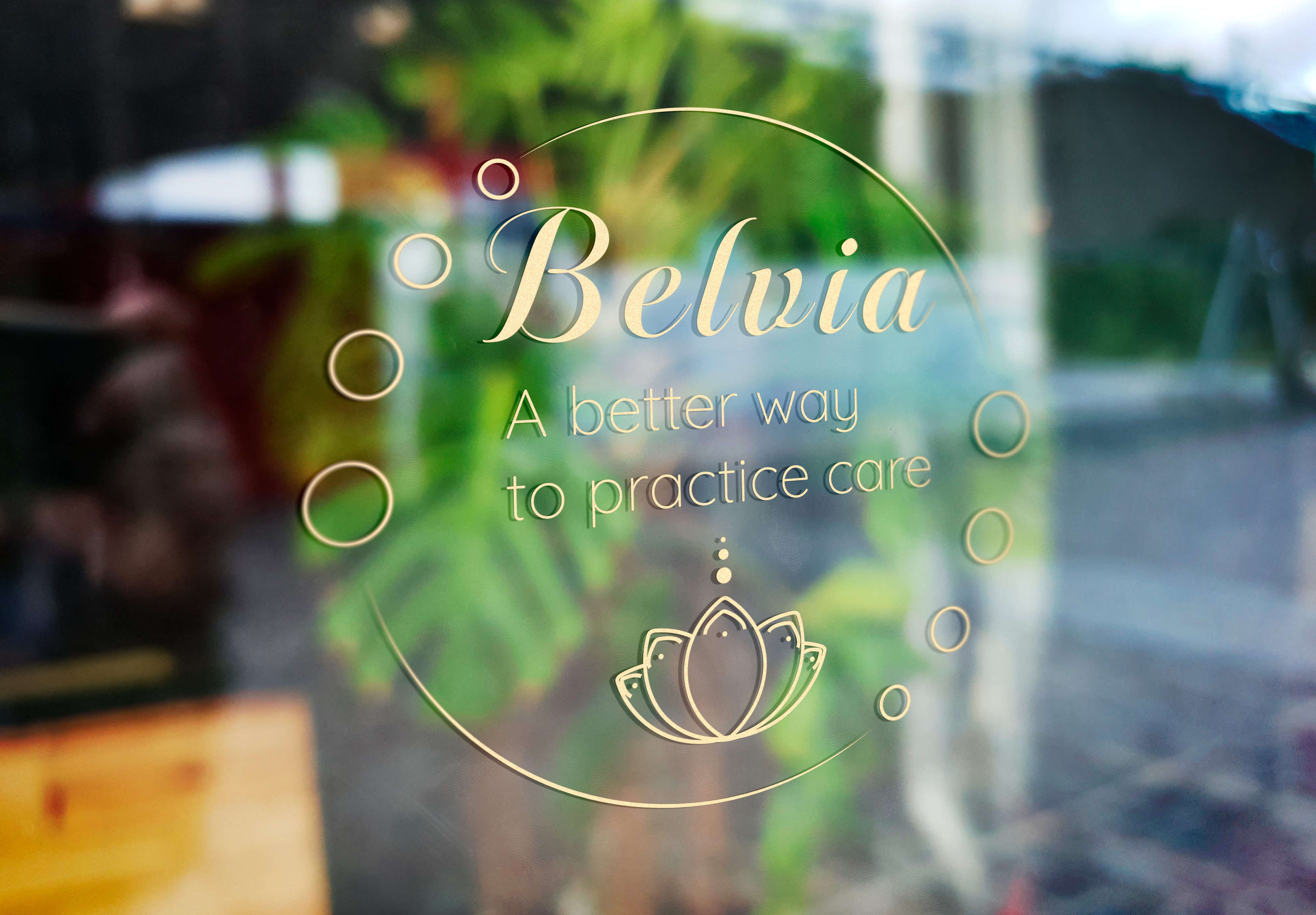
Flora Landscapes was created as a conceptual brand for a professional landscaping service focused on sustainability and thoughtful design. The identity is intended to feel reliable, grounded, and closely connected to natural environments.
Focus
The focus of the project was to develop a flexible brand system that balances professionalism with an organic, natural feel. The identity needed to work across both detailed and minimal applications, from signage to small printed materials.
Design Approach
Core Idea
The core idea centers on harmony between structure and nature. The brand reflects the idea that well-designed landscapes are carefully shaped yet allowed to grow naturally over time.
Visual Choices
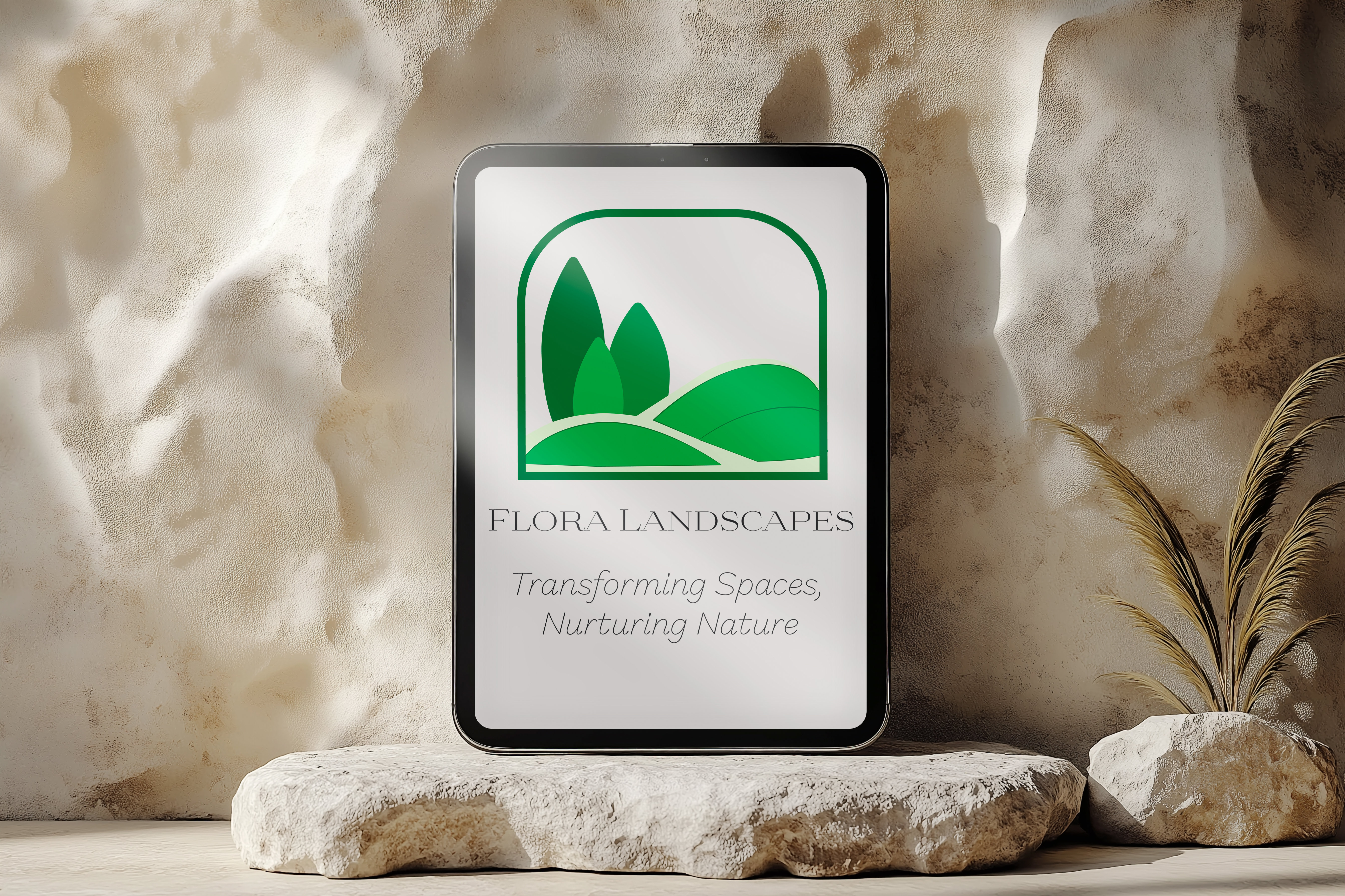
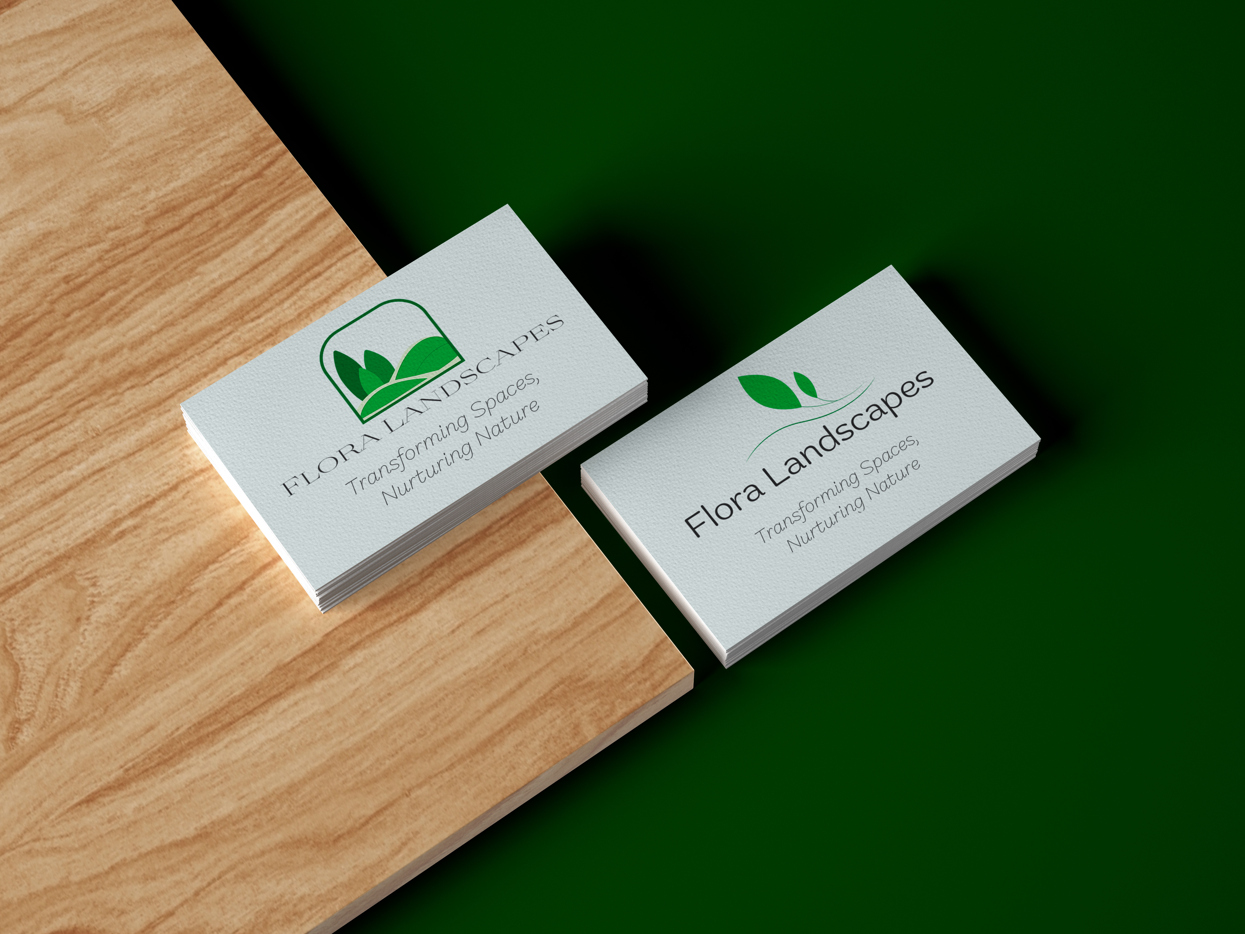
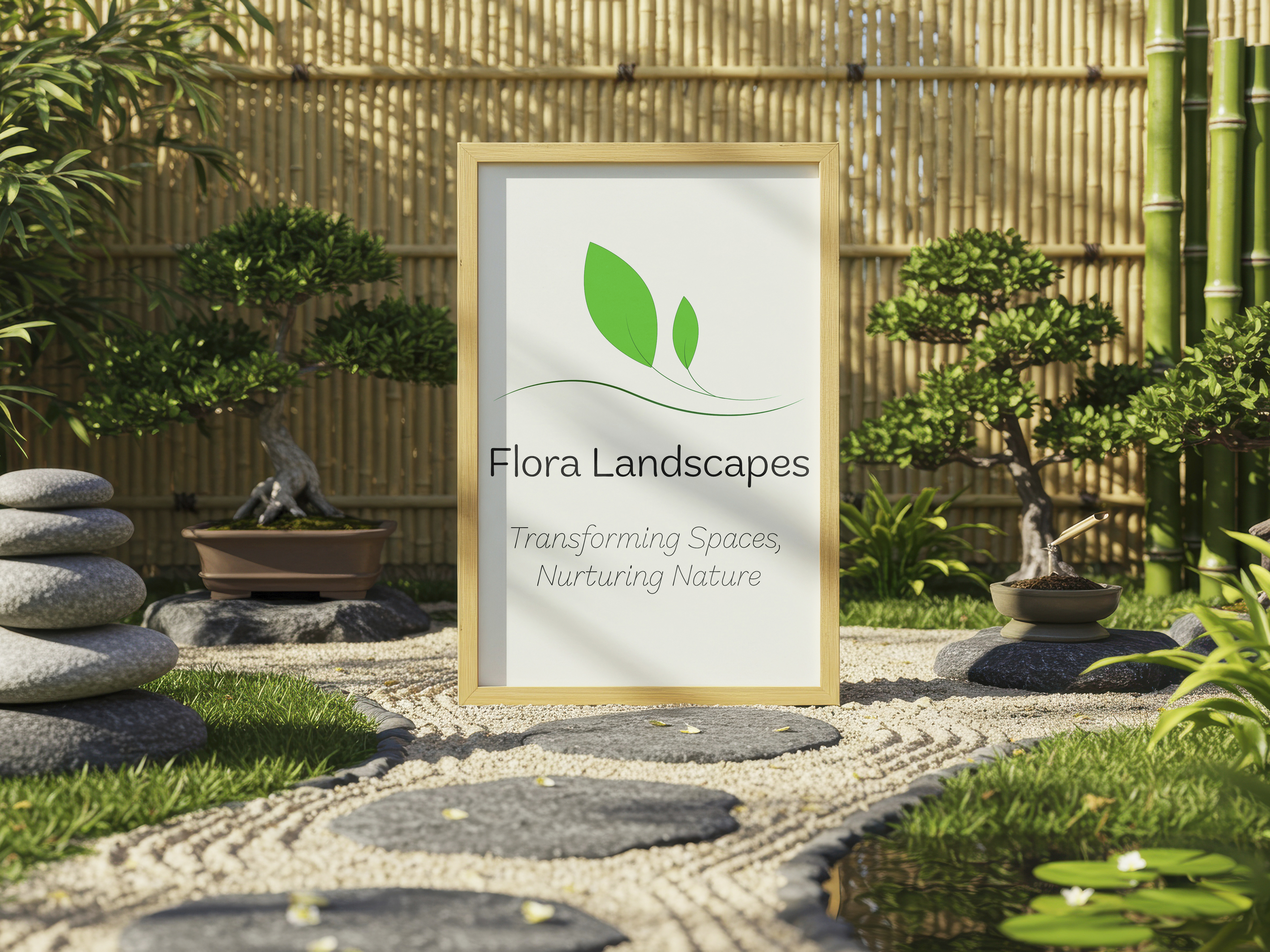
Two logo directions were developed to support different use cases. The primary logo features abstract trees and hills framed within a structured arch, symbolizing transformation, stability, and nurtured growth. A secondary simplified logo uses clean leaf forms for clarity at smaller scales.
Color & Type
The color palette draws from earthy, natural tones to create a calm and trustworthy impression. Typography was chosen to feel clear and professional, supporting readability while maintaining a soft, organic character.
Outcome
Process
The process began with keyword exploration and moodboarding focused on natural forms, organic curves, and sustainable design. Sketches and vector studies led to two distinct logo directions, which were tested through business card and signage mockups.
Final look
The final identity is clean, flexible, and scalable. Both logo versions work together as a cohesive system, adapting easily to different formats while maintaining a consistent visual tone.
What It shows
This project explores how brand identity can balance clarity and flexibility. It focuses on creating a system that works across practical applications while staying visually connected to nature and growth.
Final notes
Flora Landscapes is built around a quiet, considered visual language. The identity leaves space for nature to lead, using structure only where it adds meaning - resulting in a brand that feels grounded, reliable, and sustainable over time.
Year of
Design Experience
Projects
Completed
Hours of
Design Practice
Design
Certificates